MVP SaaS platform for landscape design Land 3D
Context
What does it do
The platform helps users visualize the plot, plan the placement of objects, calculate distances, and make faster decisions before landscaping or buying materials.
Who is it for
Users aged 35+, who already own or want to buy a plot of land/house. People who don’t work with complex digital tools and expect a clear interface without having to spend hours figuring it out.
Main task
Create and launch an MVP in a short time
Research
What did you do?
Studied the mechanics
Reviewed the reviews
Competitive analysis
In-depth interview
User flow
To properly design the interface, it was necessary to dive into the mechanics and understand how it worked. Competitor analysis and the use of our own service with similar functionality, which we had already built earlier (about 20 years ago), helped with this. For that same service, I also conducted interviews with new users, which likewise formed the basis for creating Land 3D.

Problems
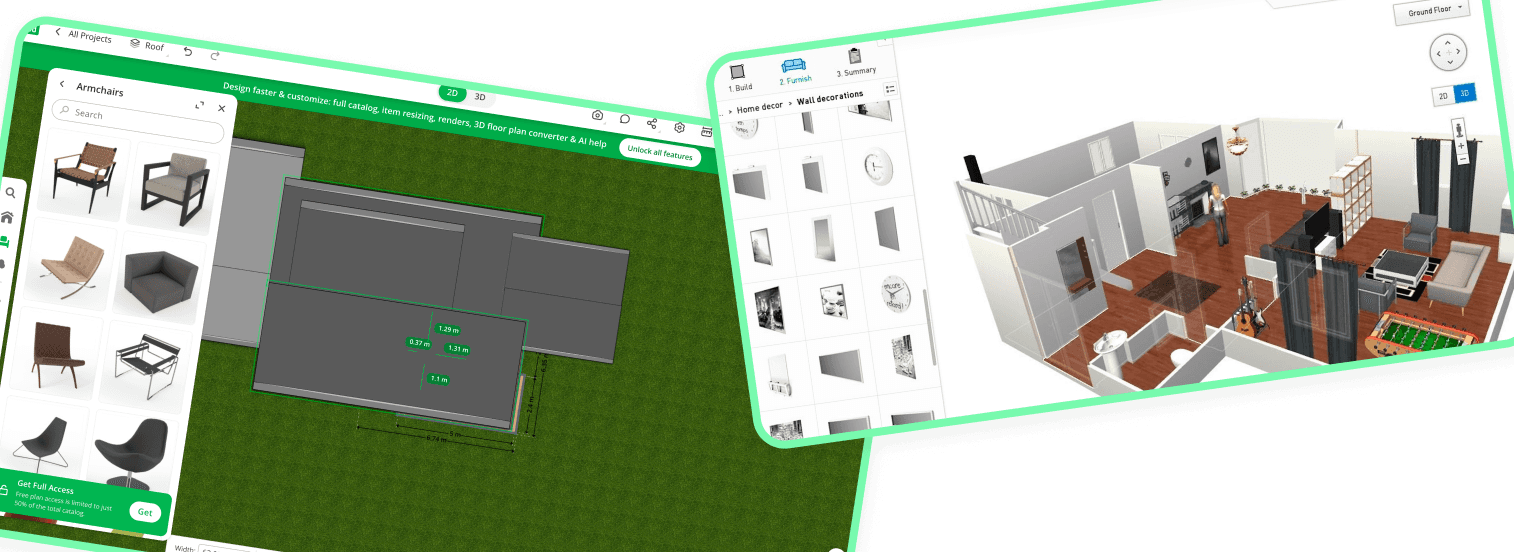
After studying competitors, the mechanics of the processes, and user feedback, as well as conducting interviews about a similar service, I identified a list of problems:
Overloaded interface
The user sees too many tools at once
Solutions
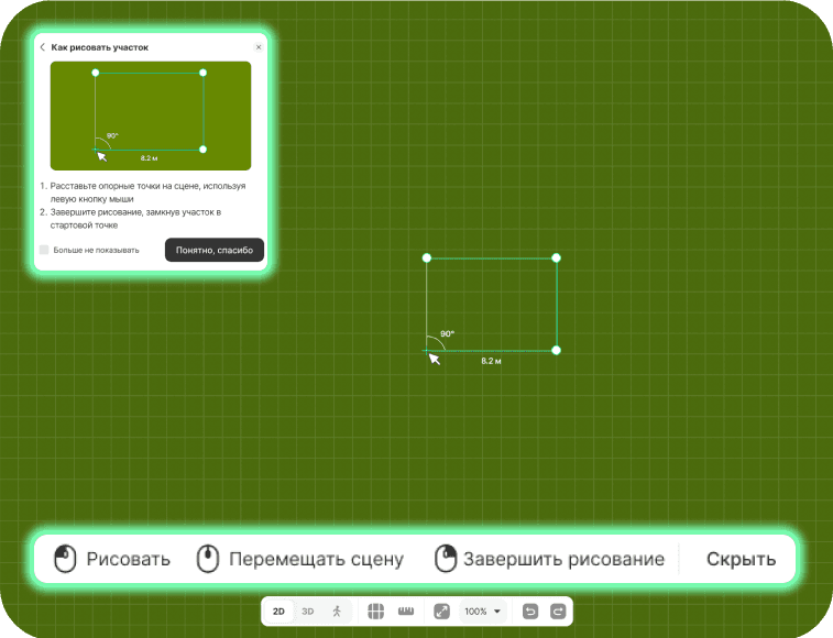
Contextual hints
To avoid lengthy onboarding, tips were provided for all the main interaction scenarios. For example, when drawing a plot or switching between 2D/3D views
Search objects
Search in each section, and also presented as a separate function directly in the panel for quick access.
In catalogs, tags for faster searching of the needed categories
4-step onboarding
During your first introduction, onboarding will help you understand the navigation. For a more detailed introduction to the features, a video guide is provided.


No repetition or duplication of the same actions within view. All tools are logically grouped.
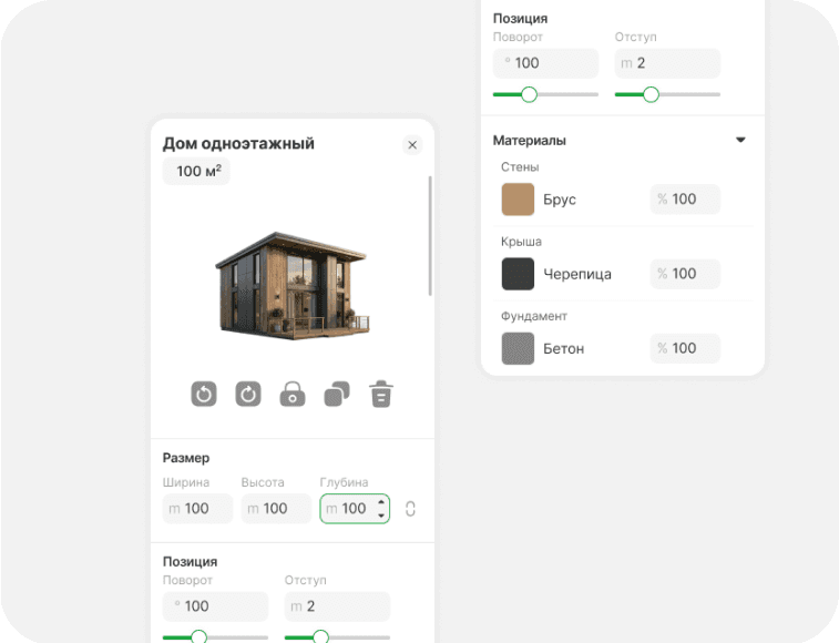
Properties panel
The panel appears when an object is first added, when the object is clicked, and disappears after the interaction ends.

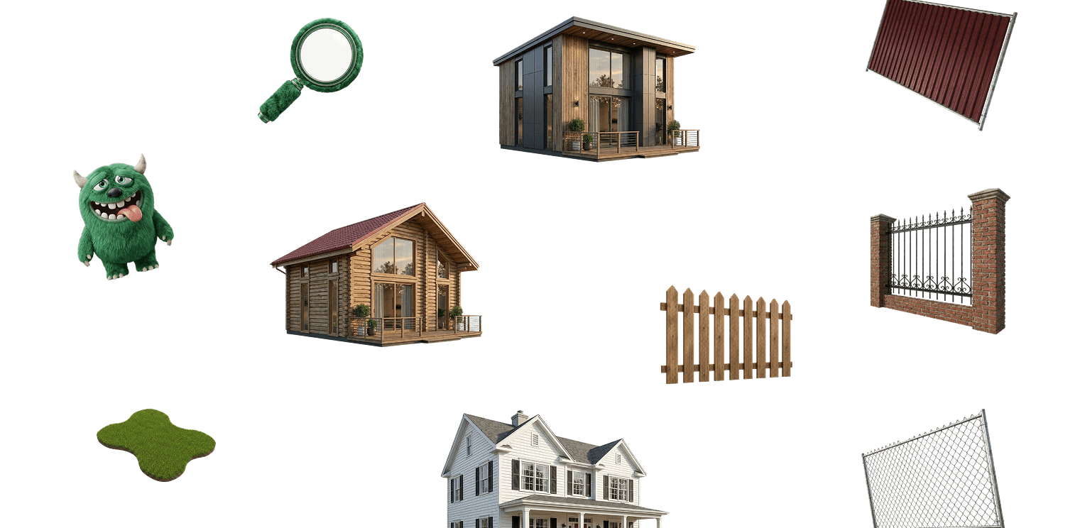
AI content
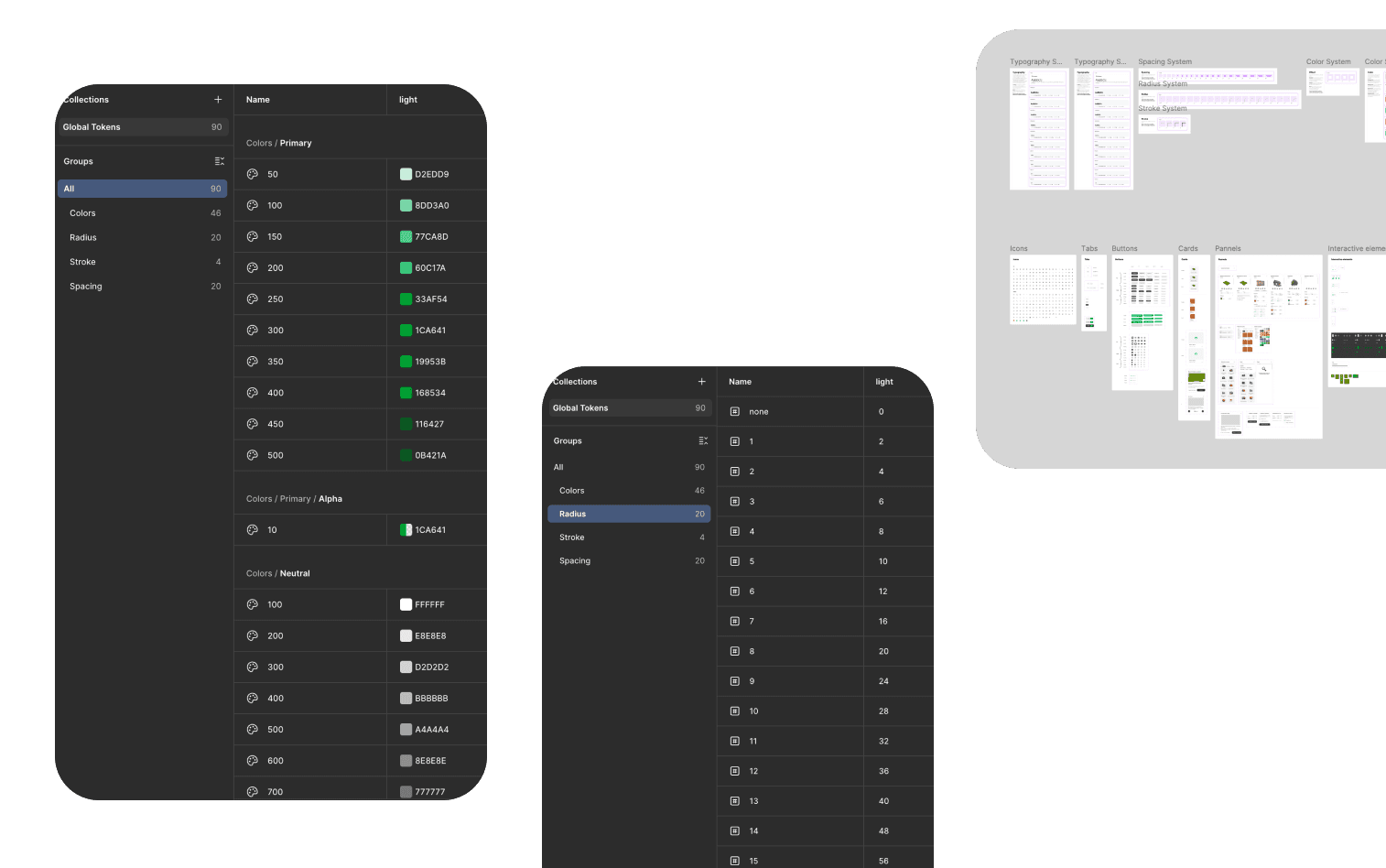
Design system
Initial design system for rapid MVP creation
Summary
Interim results in numbers over 3 months
Users saved the project after using the program for the first time
36%
The service was reopened within 14 days after the initial launch
3.8%
Conversion of new users to a paid subscription within the first 3 months